


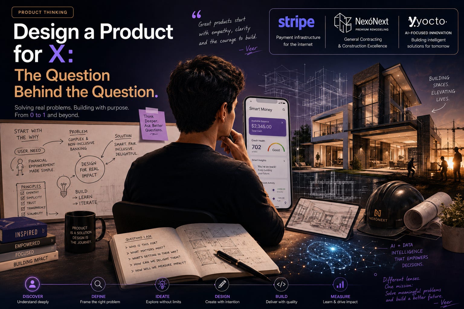
“Design a remittance product for restaurant workers.” “Design a banking app for teenagers.” “Design a way for freelancers to set aside taxes.” If you interview for product roles long enough, you’ll get some version of this maybe a hundred times. And the first instinct almost everyone has — including smart, senior people — is to start designing. Screens, features, a clever name. It feels productive. It’s a trap.
The prompt says “design.” The interviewer means “show me how you’d decide what to design.” Those are not the same activity, and confusing them is the most common way I see strong candidates underperform.
Let me walk through how I’d actually handle one of these, and more importantly, why each move matters — because the moves are identical to what you’d do on the job, just compressed into forty minutes with someone watching.
The first sixty seconds are about scope, not ideas
When you hear “design a banking app for teenagers,” the worst thing you can do is answer it. The best thing you can do is narrow it until it’s answerable.
I’d say something like: “Before I design anything, I want to scope this. ‘Teenagers’ is a huge range — a 13-year-old’s relationship with money is nothing like a 17-year-old’s about to leave for college. And I want to know the goal: is this a standalone product trying to win the teen market, or a feature inside a parent’s existing bank to grow household relationships? Those lead to very different products. Let me pick one and tell you why.”
That paragraph does three things at once. It shows I won’t design for a phantom average user. It surfaces that the business goal changes everything. And it puts me in control of the prompt instead of being jerked around by it. Interviewers love this because it’s exactly what they wish junior PMs did before building.
A quick word on a real tension here: don’t ask twenty clarifying questions and stall. I’ve seen candidates use “clarifying” as a way to avoid committing. Ask the two or three that genuinely change your answer, then make a call and move. Decisiveness under ambiguity is part of what’s being graded.
Pick a user so specific it’s almost uncomfortable
Once I’ve scoped, I commit to a person. “I’ll design for a 16-year-old who has a part-time job, gets some money from parents, mostly spends through their phone, and has zero formal financial history.” Now every later decision has something to push against.
The reason specificity wins is that it makes your tradeoffs visible. If I’m designing for that 16-year-old, parental controls are a feature and a tension — too much control and the teen feels surveilled and churns; too little and the parent never signs off, and the parent is the one funding the account. I can only see that tension because I named both people. Vague users hide tradeoffs. Specific users expose them.
Get to the problem before the solution — every time
Here’s the discipline that separates the answer that passes from the answer that shines. Before any feature, I name the problem in the user’s language.
For our teenager: the real problem isn’t “no bank account.” It’s that they’re about to enter adulthood having never made a financial decision with consequences, and the first time they do, the stakes will be a credit score or an overdraft, not lunch money. The job the product can do is let them practice with money while the stakes are still small. That reframing is the whole product. Once I have it, the features almost design themselves: visible spending, gentle limits, a savings goal they choose, a parent who can see but mostly shouldn’t intervene.
If you skip this step and jump to features, your features have nothing to be judged against, and they’ll come out generic. With the problem named, even a simple feature looks intentional.
Generate options, then choose — don’t just present your favorite
A subtle tell of seniority: showing the road not taken. Instead of presenting one polished idea, I’ll briefly lay out two or three directions and pick.
For the teen account, the directions might be: a training-wheels product centered on supervised practice; an independence product that leans into “this is YOUR money, no parents”; or a learning product wrapped around financial education content. They’re genuinely different bets. I’d choose training-wheels for a 16-year-old because the core problem was practice-with-low-stakes, and independence over-rotates on autonomy the user isn’t quite ready for while education products tend to get great download numbers and terrible engagement (nobody opens an app to be taught).
That last line matters. Choosing means rejecting with a reason. “Education apps get downloads and no engagement” is a point of view earned from having watched it happen. You don’t have to be right. You have to show you weighed it.
Name the risk you’re most worried about
I always close a design answer by saying what would keep me up at night. For the teen product: the regulatory and trust burden of holding a minor’s money and data is enormous, and a single story about a kid getting defrauded would sink the brand. So if I were really building this, the unglamorous work — sponsor bank relationships, age verification, data protections for minors, fraud monitoring tuned for inexperienced users — would be at least half the roadmap, even though none of it shows up in a demo.
Saying this does something specific: it proves you understand that in fintech, the demo is the easy 20%. The interviewer who builds real money products is silently relieved that you get it.
The structure, stripped down
If you want a portable version of all that: scope it, pick a person, name their problem, offer a few directions and choose one, then name the biggest risk. Talk the whole time. Think out loud. The interviewer is grading the narration, not the destination.
On the job, this is Tuesday at 10 a.m.
The reason I push so hard on this isn’t interview performance. It’s that “design X for Y” is just a roadmap conversation with the clock sped up. Every quarter, someone hands you a fuzzy directive — “we need a product for small businesses,” “let’s go after Gen Z” — and your job is to do exactly this: narrow it, pick the real user, find the actual problem, choose a direction over the alternatives, and flag the risk that the directive ignored. PMs who can’t do this build whatever the loudest stakeholder described. PMs who can turn a vague mandate into a sharp bet. Same muscle. The interview just removes the six weeks you’d normally have to hide your reasoning.
Try this before next Tuesday
Take a prompt — “design a tool to help couples manage shared expenses” — and give yourself eight minutes and a blank page. Spend the first two minutes only on scoping and choosing your user. Don’t let yourself name a single feature until minute three. It’ll feel slow and wrong. Do it anyway. Then notice how much sharper your features are when they finally arrive, because now they have a specific person and a real problem to answer to. That discomfort in the first two minutes is the skill.
Next week: the favorite-product question, and why “I love Stripe” is only the start of an answer.