

"What's Your Favorite Product?" — Turning Taste Into a Framework
Product Sense Part 03 of XX

Disclosure: I am aware that Anagram App used by Subtask to identify AI slop flags most of the posts as AI assisted. The ideas, research, and analysis in this document are entirely my own, developed from years of hands-on fintech experience. AI tools were used solely to polish grammar and sentence structure — not to generate root idea or content.
The “Favorite Product” Question Isn’t Small Talk
Everyone treats “what’s your favorite product?” like a warm-up. It isn’t one. In my experience it’s one of the fastest filters in the whole interview, because the answer tells you almost immediately whether someone experiences products the way a user does or takes them apart the way a builder does. Most candidates answer as users. “I love Spotify, the recommendations are great.” Nice thing to say. Also forgettable, and it quietly fails you.
So let me walk through what a good answer actually sounds like, why it works, and how to build your own this week instead of improvising one under fluorescent lights.
What they’re really fishing for
The interviewer does not care about your consumer habits. What they want to know is whether you have a point of view you’ll defend, whether you can trace a product’s design choices back to the business and user goals underneath them, and whether you can see what the product does badly. That last one matters more than people think. Someone who can’t criticize a thing they love won’t be able to critique their own work either.
“The recommendations are great” answers none of this. It’s a feeling. The fix is simple to state and takes practice to do: treat your favorite product like a case study you happen to have strong feelings about.
The shape of a strong answer
Here’s roughly how I coach people to structure it, and how I answer it myself.
Start with the product and why the choice matters, not just why you like it. Then who it’s for and what job it does for them. Then one specific, non-obvious design decision, and the reasoning you think sits behind it. And then the part that separates senior from junior: something it gets wrong, or a tradeoff it made, and what you’d keep an eye on if you owned it.
Let me make that concrete with a fintech example, because if you’re interviewing for fintech roles, picking a money product signals you think about the space rather than name-dropping the same consumer apps as everyone else.
Why I’d pick Wise
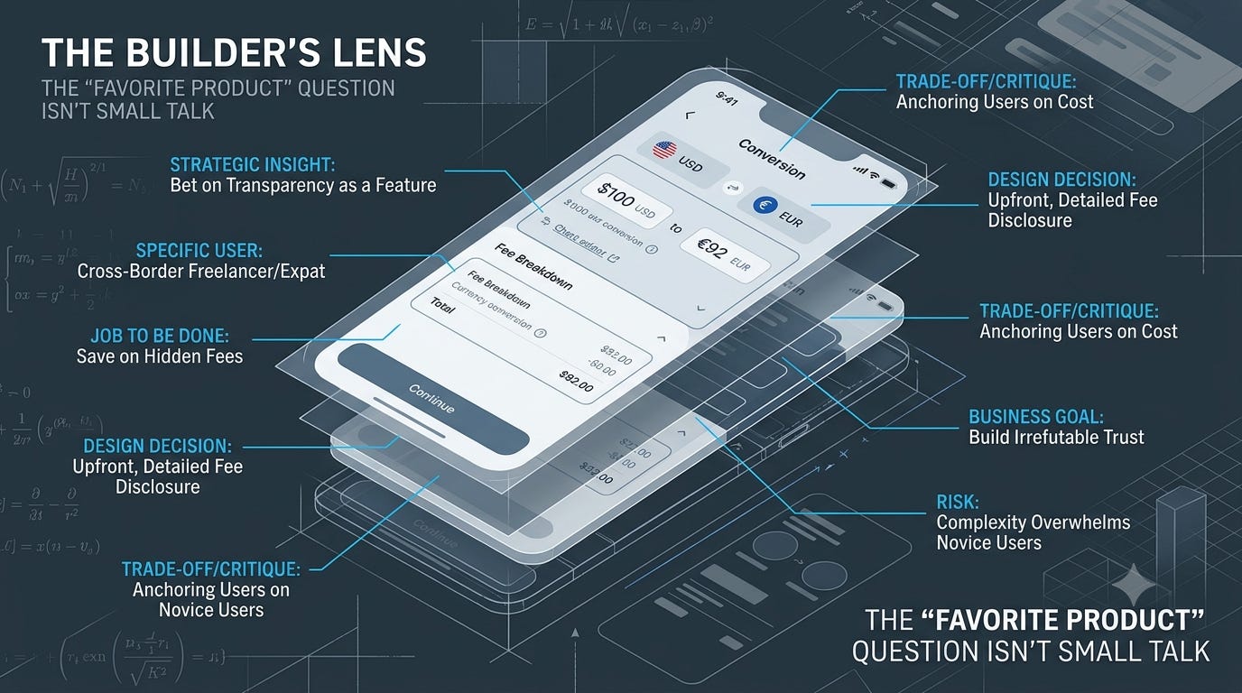
My answer would be Wise, the company formerly known as TransferWise. Not because I move money internationally all that often, but because of one decision that cuts against every instinct in financial services: before you commit to anything, they show you the fee. Broken out. In plain numbers. Including the exact exchange rate, and what a bank’s “free” transfer would really have cost you.
Why does that matter? Because the entire incumbent business of international transfers ran on opacity. Banks advertised “no fee” and took their margin from a marked-up exchange rate the customer never saw. Wise bet that transparency itself could be the feature. Show people the truth and the comparison sells the product for you. That’s a business insight expressed as a design choice. The fee breakdown isn’t some UI nicety; it’s the whole strategy, made visible on one screen.
Who is it for? People moving real money across borders. Someone sending wages home, a freelancer invoicing a client abroad, a family paying tuition overseas. For them, a hidden 3% spread on $4,000 is money they were losing without ever knowing it.
Now the part that earns the most points: what does Wise trade away? By competing so hard on transparency and price, they trained customers to anchor on cost, which leaves them exposed to anyone willing to subsidize transfers down to zero. And the radical clarity that delights a savvy user can overwhelm a first-timer who just wants to know whether it worked and when the money lands. If I owned this product, I’d watch whether the transparency that wins over the comparison-shopper quietly scares off the novice. I’d also be nervous about “cheapest” becoming the only thing the brand means.
Notice what I never said: “it’s clean and easy to use.” I tied a screen to a strategy, named the user, then turned the same critical eye on the thing I claimed to love. That’s the whole move.
Why a fintech pick beats a consumer darling
You can absolutely answer with Spotify or Notion or whatever you actually use. But in a fintech interview, a money product does two extra things for you. It shows you pay attention to the industry you’re trying to join. And it lets you demonstrate that you understand the constraints that make fintech hard — trust, regulation, the cost of getting things wrong — which a music app just won’t let you show.
If you do go consumer, at least connect it to a hard problem. “I like Robinhood’s onboarding because they got someone from download to first trade in under five minutes, which in a regulated, KYC-required product is hard and forced real choices about what to defer” is a fintech-literate answer even though Robinhood is a consumer brand. “I like Robinhood because investing feels fun” is not. Worse, it invites a follow-up about whether making investing feel like a game is responsible, and you’d better have thought about that before it’s asked.
The trap inside the trap
There’s a version of this question that’s really a values check, and fintech interviewers love it: “what’s a product you think is well-designed but ethically questionable?” Or, after you’ve praised something, “what makes you uncomfortable about it?”
Have an answer ready. The honest one — Robinhood’s confetti and frictionless trading is brilliant engagement design and it nudges inexperienced people toward behavior that’s often bad for them — shows you can hold both truths at once. That’s exactly the judgment fintech PMs get hired for. A candidate who can only cheerlead becomes a liability the moment the engagement metric and the user’s interest point in opposite directions. In this industry, they regularly do.
Your favorite reveals your taste
There’s something deeper underneath this question, past whether you can analyze a product. It reveals your taste: what you value, what you think good looks like, where your instincts point when nobody’s telling you the answer. Taste matters because it’s what guides you in all the moments with no data, no time to test, no obvious call — when you just have to decide what good is. An interviewer learning what you admire is learning what you’d reach for when you’re the one deciding.
Which is why a thoughtless answer costs more than it seems. Admire a product purely because it’s slick or popular, and you’ve revealed taste that runs to surface polish and social proof — which predicts the kind of product you’d build. Admire a product for a hard, non-obvious choice made in service of users (Wise’s transparency, say, or a product that deliberately reduced engagement for the user’s own good), and you’ve revealed something very different.
In fintech specifically, your taste signals what you’d optimize for when the metrics and the user’s interest diverge. And they diverge constantly. Admiring a product that chose user trust over short-term extraction tells the interviewer your instincts point the right way for a domain where that exact choice comes up over and over. Admiring aggressive growth with no apparent regard for users tells them the opposite. So underneath its casual surface, the favorite-product question is partly a probe: what do you think good looks like, and would your instincts serve users when no one’s measuring? Have an answer that reveals taste you’d want in a colleague.
On the job, this is just a teardown
The reason this question maps to real work: “analyze a product you have feelings about” is literally what you do every time you evaluate a competitor or critique your own team’s design. The skill of separating what I feel from what choice was made, and why is what keeps design reviews productive instead of turning them into a war of opinions. The PM who says “I don’t love this flow, but here’s the specific decision I’d challenge and the user problem I think it misses” moves the conversation forward. The one who says “it feels off” stalls it.
So building a real answer here isn’t prepping a party trick. You’re rehearsing the thing you’ll do in every product review for the rest of your career.
Try this before next Tuesday
Pick one product you sincerely admire and write four short paragraphs: the strategic insight behind it, the specific user and job, one design decision with the reasoning you infer behind it, and one thing it gets wrong or trades away. Then do the harder version. Pick a product you admire that you also find a little ethically slippery, and write the two-sided take without flinching. Keep both. You’ll use them in an interview within a year, and in the meantime you’ll have sharpened the exact lens every product review demands.
Next week: “how would you improve our product,” and why “add dark mode” is a one-way ticket to the rejection pile.